Implementing an underspecified CSS feature (flexbox gaps)
While the CSS specifications have come a long way in recent years, it is still the case that some features are vague and underspecified.
I’ve recently implemented one such feature in Ladybird, and I thought it could be interesting to share how it went.
The feature in question is support for gaps (sometimes called “gutters”) between boxes in a CSS flex layout.
Here’s a quick example so you know what we’re talking about:
<div style="display: flex; column-gap: 1em;">
    <div style="padding: 1em; background: #a8e6cf;">well</div>
    <div style="padding: 1em; background: #dcedc1;">hello</div>
    <div style="padding: 1em; background: #ffd3b6;">friends</div>
</div>
History of gaps in CSS
If I’ve understood things correctly, gaps were first added to CSS with the CSS Grid Layout module.
The original grid properties were called grid-column-gap and grid-row-gap but eventually someone realized that this feature could be useful in other layout modules as well, and two aliases were added: column-gap and row-gap.
Gaps are now specified in CSS-ALIGN-3, under “Gaps Between Boxes”.
<div style="display: flex; column-gap: 2em;">
    <div style="padding: 1em; background: #a8e6cf;">well</div>
    <div style="padding: 1em; background: #dcedc1;">hello</div>
    <div style="padding: 1em; background: #ffd3b6;">friends</div>
</div>
Okay, let’s read the spec...
Here’s what CSS-ALIGN-3 says about gaps between items in a flex layout:
When applied to the main axis (e.g. column-gap in a row flex container), indicates minimum spacing between items (as if an additional fixed-size margin were inserted between adjacent flex items in a single line).
When applied to the cross axis (e.g. row-gap in a row flex container), indicates minimum spacing between adjacent flex lines.
The flex layout spec itself, CSS-FLEXBOX-1, does not mention gaps at all.
In other words, those two measly sentences from CSS-ALIGN-3 are everything we have to go on for implementing this feature!
Implementing it in Ladybird
Based on the text from CSS-ALIGN-3 above, here’s how I ended up implementing gaps in Ladybird’s LibWeb engine:
First, I defined two helper concepts: main gap and cross gap which are direction-dependent aliases for the column-gap and row-gap properties. These are important because the flex layout algorithm abstracts away the horizontal/vertical axes in favor of main/cross axes.
Then, I made the following adjustments to the flex layout algorithm:
When collecting flex items into flex lines and flex-wrap is not no-wrap, we now take the main gap into account when deciding whether to begin a new flex line after an item.
When resolving flexible lengths, we now include the main gap between items when calculating the sum of outer hypothetical sizes and sum of outer flex base sizes.
When handling ‘align-content: stretch’, we now include the cross gap between items when calculating the sum of flex line cross sizes. (Fun fact: I actually discovered while writing this post that this step was necessary!)
When distributing any remaining space, we now include the main gap between items when calculating the amount of used space in the main axis. We also use the main gap as an additional offset when aligning flex items along the main axis.
When aligning all flex lines, we now include the cross gap between flex lines when calculating the sum of flex line cross sizes. We also use the cross gap as an additional offset when aligning flex lines along the cross axis.
When calculating the flex container’s intrinsic main size, we now include the main gap between items when calculating the largest sum of contributions within each flex line.
When calculating the flex container’s intrinsic cross size, we now include the cross gap between flex lines when calculating the sum of flex line cross sizes.
While I’m not completely confident that these adjustments match exactly how other browsers behave, the various test cases I’ve constructed do render identically in Ladybird, WebKit, Blink, and Gecko.
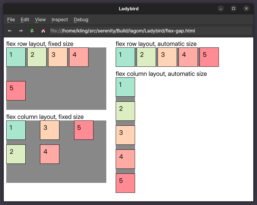
Before & After
Here’s what we looked like before:
And here’s what we look like now:
When will flexbox gaps be properly specified?
There’s an open issue against CSS-FLEXBOX-1 about updating the layout algorithm to take gaps into account. It appears that the work has been deferred to CSS-FLEXBOX-2, which (as far as I can tell) is not in development yet.
Closing remarks
While a large portion of modern browser development is translating specification text into code, there are still areas where specifications don’t yet cover everything that production browsers actually support.
Since Ladybird aims to render the contemporary web correctly, we have no choice but to support these features as well. Specifications will eventually catch up, and we’ll update our implementation when that happens.
Fun fact: I discovered multiple bugs in our flex layout implementation while editing this very post. They have now also been fixed!
Finally, if you like what I’m doing, please consider sponsoring me on GitHub or Patreon. I’m working on SerenityOS and Ladybird full time, thanks to the generous support of many sponsors. You can also follow me on Twitter.


